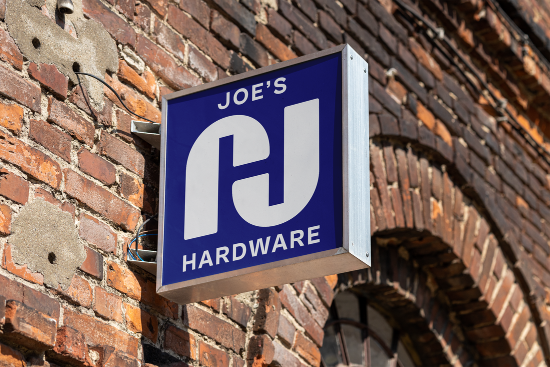
The brand identity for furniture design brand Joe's Hardware is centered around a mid-century-inspired mark that utilizes simplicity, symmetry and negative space. The two J's form an H and represents the brand while remaining elegant and timeless. When combined with a strong grotesque wordmark that has character and a punchy primary colour palette, the overall brand strikes the "warm minimalism" briefed by the client.
The brand is currently yet to be launched.


